LIA
A content redesign of LIA eLearning web application.
Overview
LIA (Life Insurance Association) sought our help to help redesign their eLearning web application. My primary role was to assess their information architecture and content layout to optimize the user’s interaction experience.
Role
Content Strategist
About the Problem
The main issue with LIA’s application was its confusing navigation, both on desktop and on mobile. I was provided with specific user goals that were difficult to achieve with the current information architecture.
Goal
Apply good use of content strategy and design to allow users to navigate though the application easily.
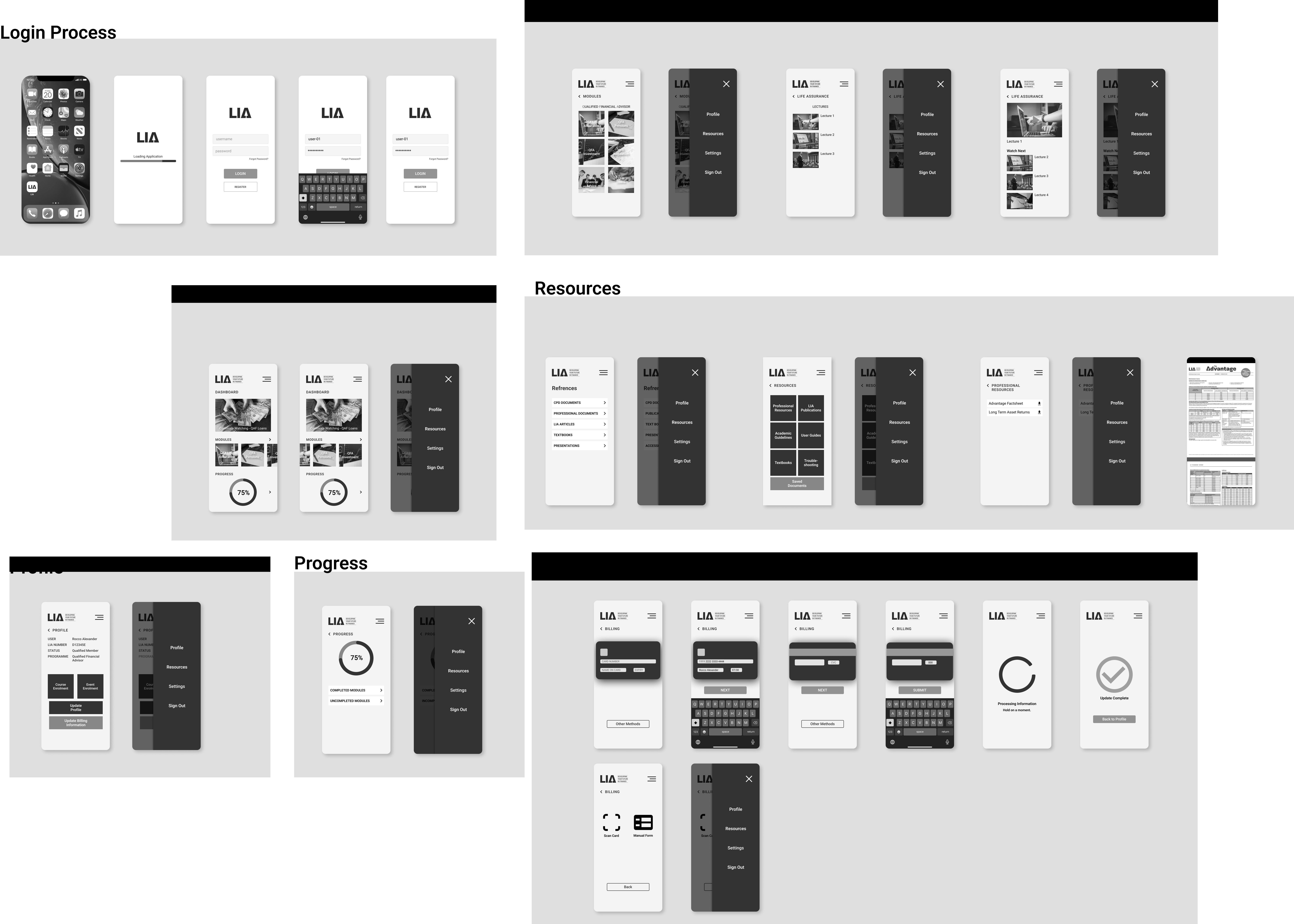
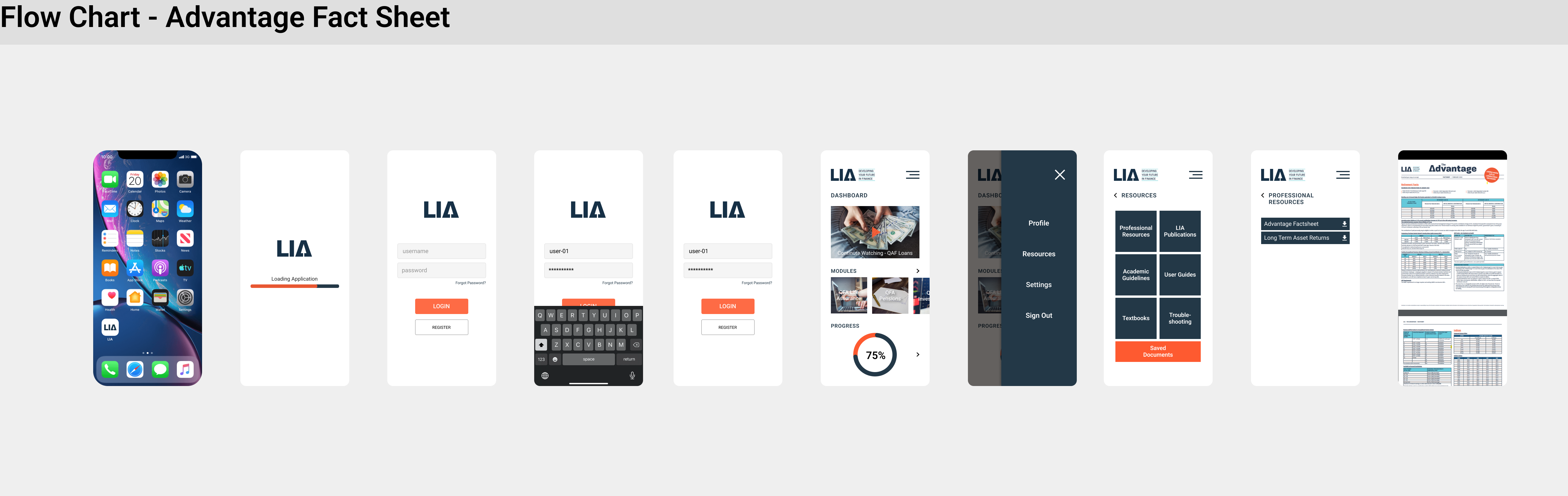
Ideation
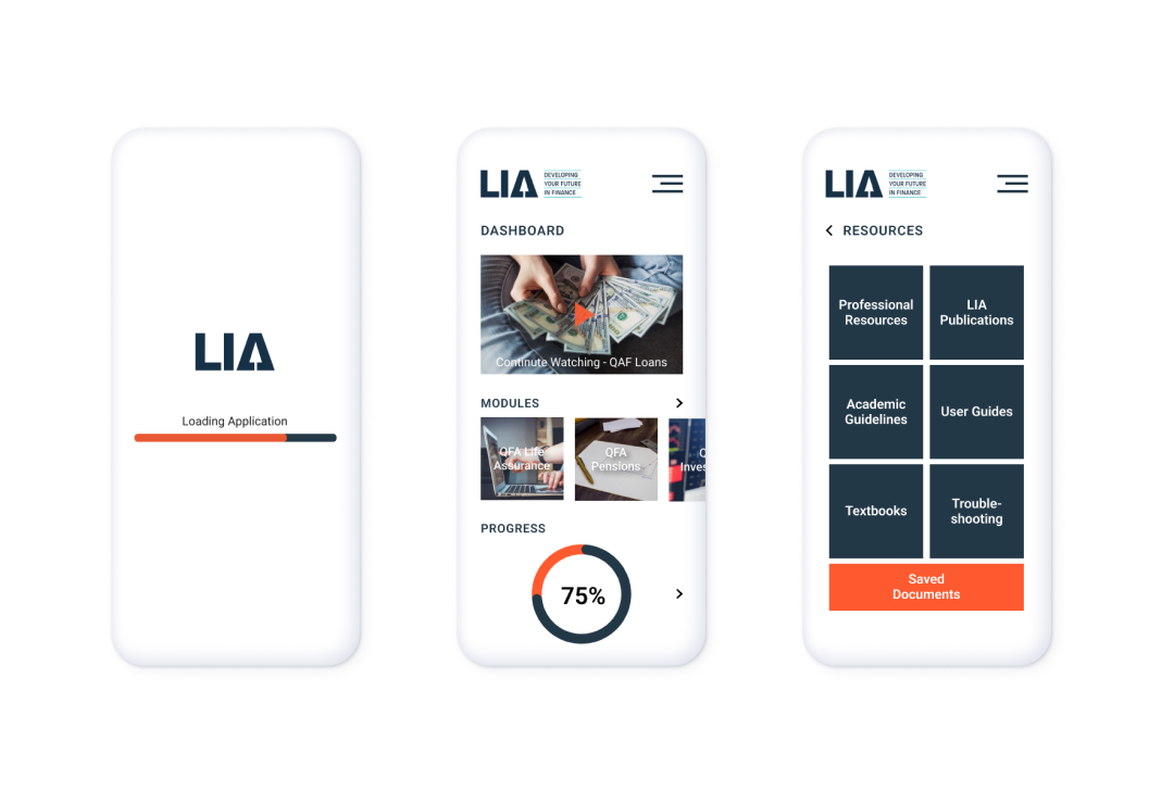
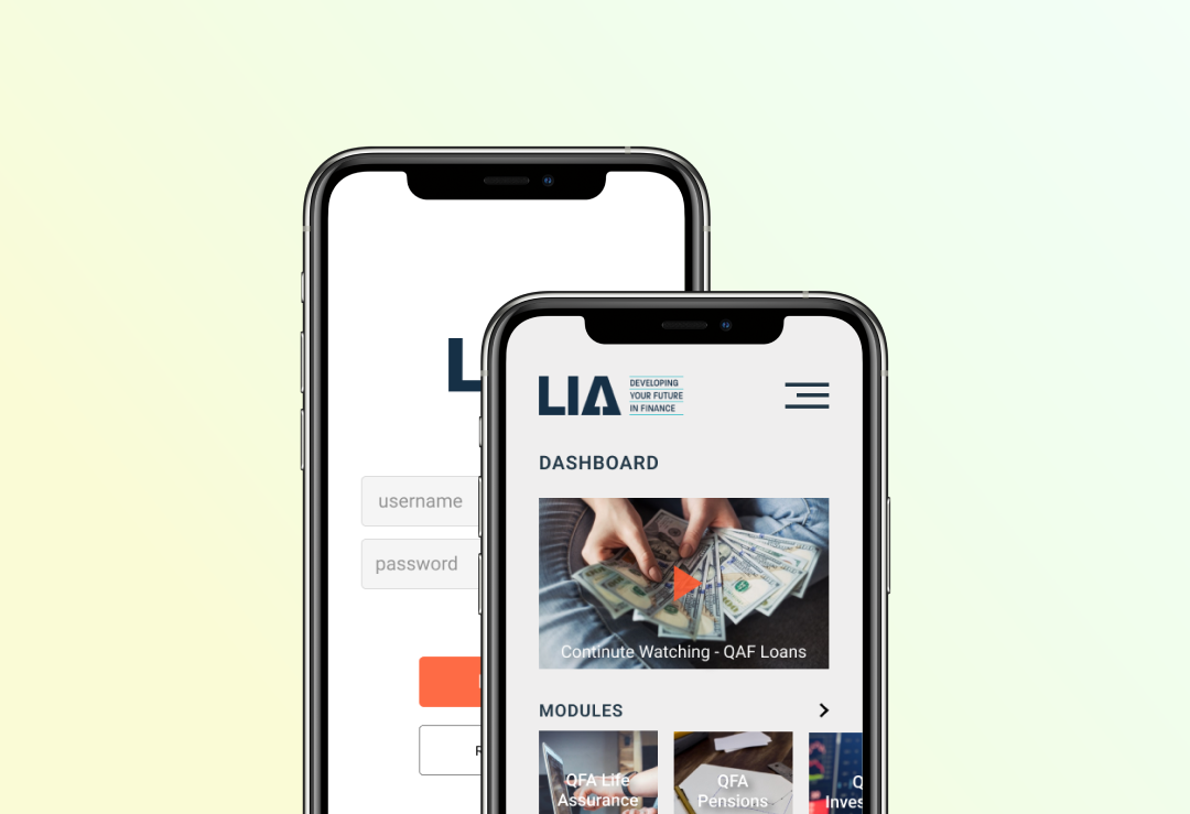
The wireframes were design with LIA’s existing design language in mind. The main goal was not to improve the user interface, but to create a simple navigation path towards my user goals.
The key concept behind my ideation was to use Steve Krug’s law: Don’t Make Me Think! This concept enforces that important features should be no more than three clicks away. This ideology is reflected in the wireframes and prototypes.
Final Product
The final product saw measurable improvements over the current design. From a navigation perspective, the new design reduced navigation times by as much as 50%. This is largely due to the previous designs hiding features behind many pages combined with confusing wording.